Recently I had the privilege of working with Bonnie Cauble from Crate & Barrel on a Mother's Day teacup. It was a really fun project and I want to share some of the drawings behind the final artwork. I began working on this on July 25, 2013, knowing that it would be released for Mother's Day, 2014. The teacup is part of a series of limited edition Mother's Day cups by various artists. I had a few days to do the whole thing, from start to finish. Luckily it was a pretty straightforward project. Bonnie's only direction for me was "It has to say Mom!" No art director has ever give simpler instructions. She sent me a template for the cup and saucer, and I started with some sketching. We agreed to work on the cup first, and once the direction was chosen, I would work on the saucer. Here are the initial drawings for the cup:
Sketch #1
Sketch #2
Sketch #3
As you can see, we didn't have time to do 50 drawings. We were working quickly and there wasn't much conceptual work to be done. Mainly, I wanted the typography to be strong and feminine, something that would appeal to mothers. After looking at the first limited round of sketches, Bonnie thought that Sketch #2 was the best direction for the teacup. She wanted to remove the large spaces between the letters M-O-M so that the word MOM could be read all at once on one side of the cup. Here is the revised drawing following the changes:
Revised artwork drawn on a light table with a Micron Pen.
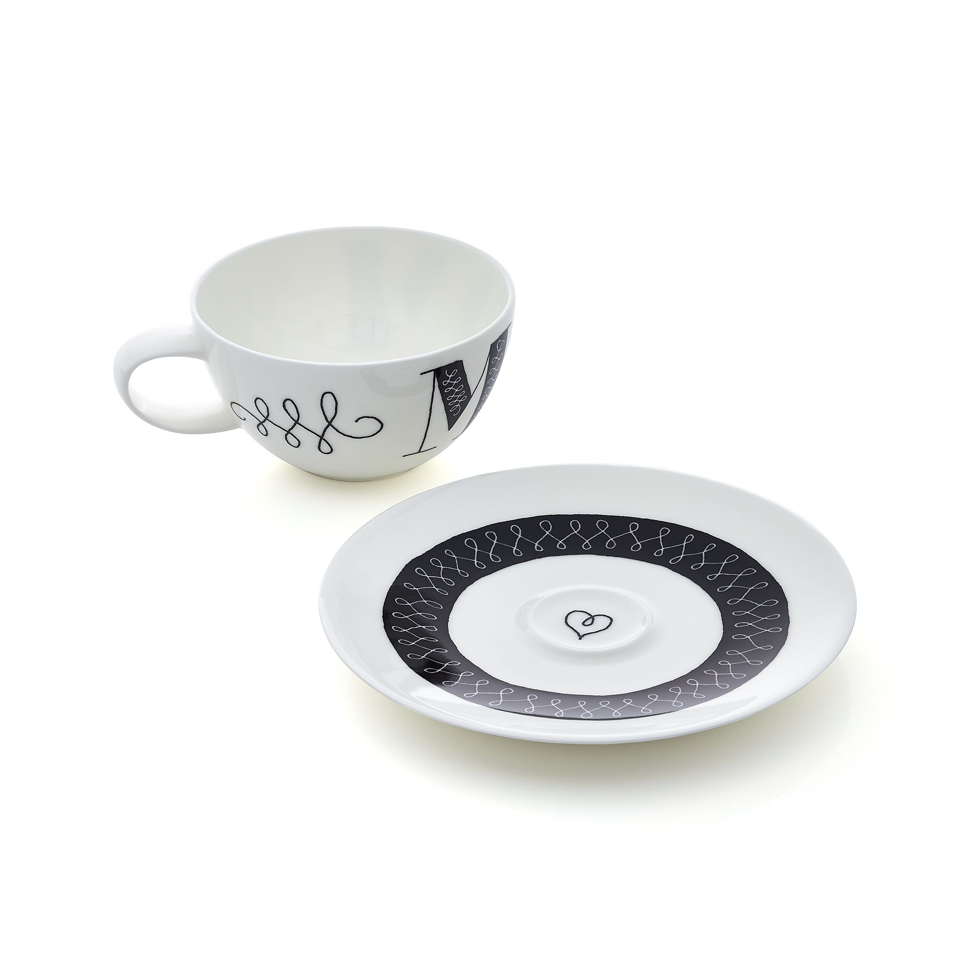
Following the style of the lines on the cup, I set about creating the artwork for the saucer. The little heart in the middle is meant to offer a pleasant surprise after the cup is lifted.
Original Scan of the saucer artwork.
I knew I wanted the final artwork to retain a hand-drawn style, so I never planned on creating sharp-edged type and lines. Instead, I scanned the pen drawings at a very high resolution and then used livetrace in Adobe Illustrator. The artwork had to be in a vector format according to the specifications. I presented three variations of the final artwork, which you can see below.
Final Option #1: Retain pen outlines in black.
Final Option #2: Reverse pen artwork to fill in the letters with black.
Final Option #3: I added a light blue/green as a two-color option.
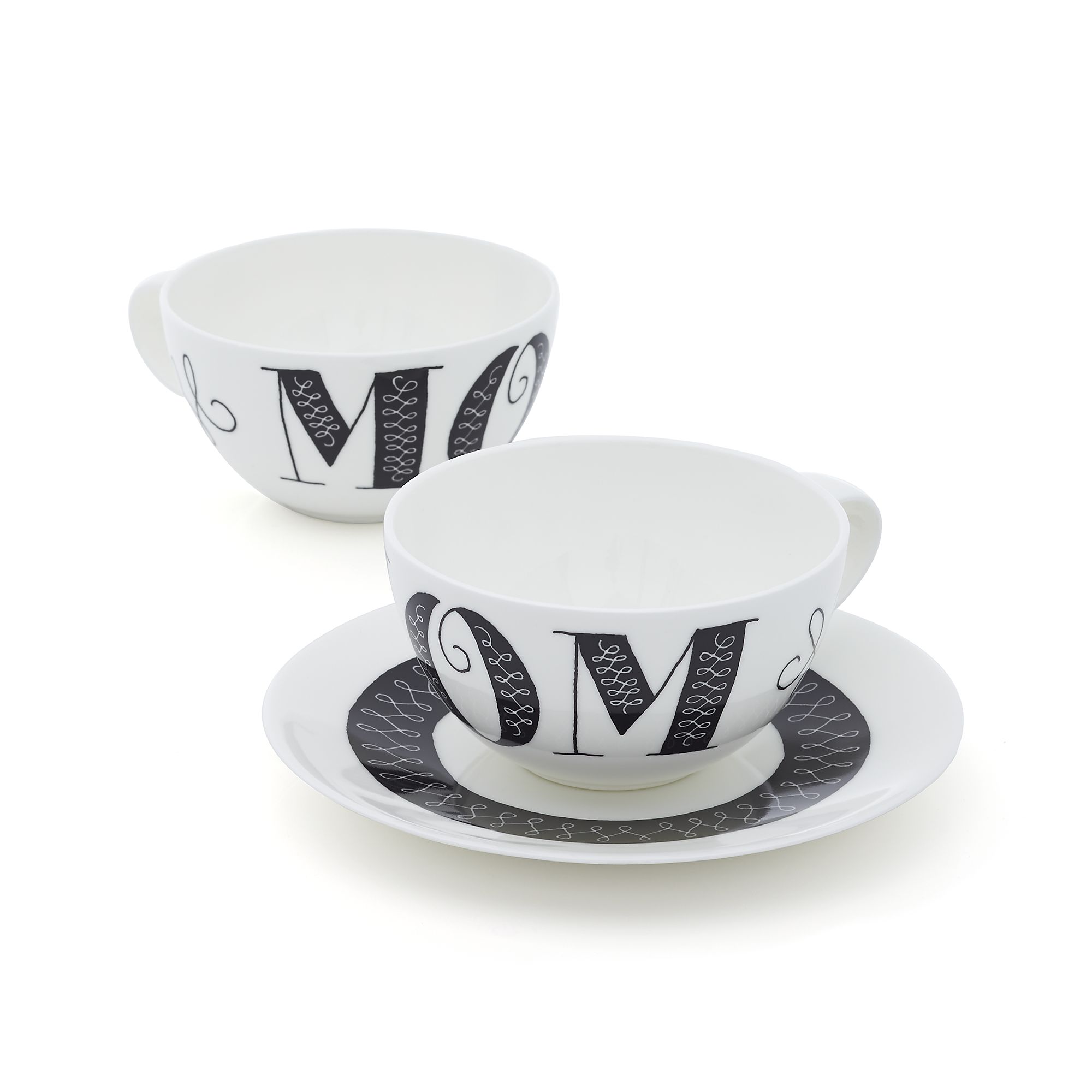
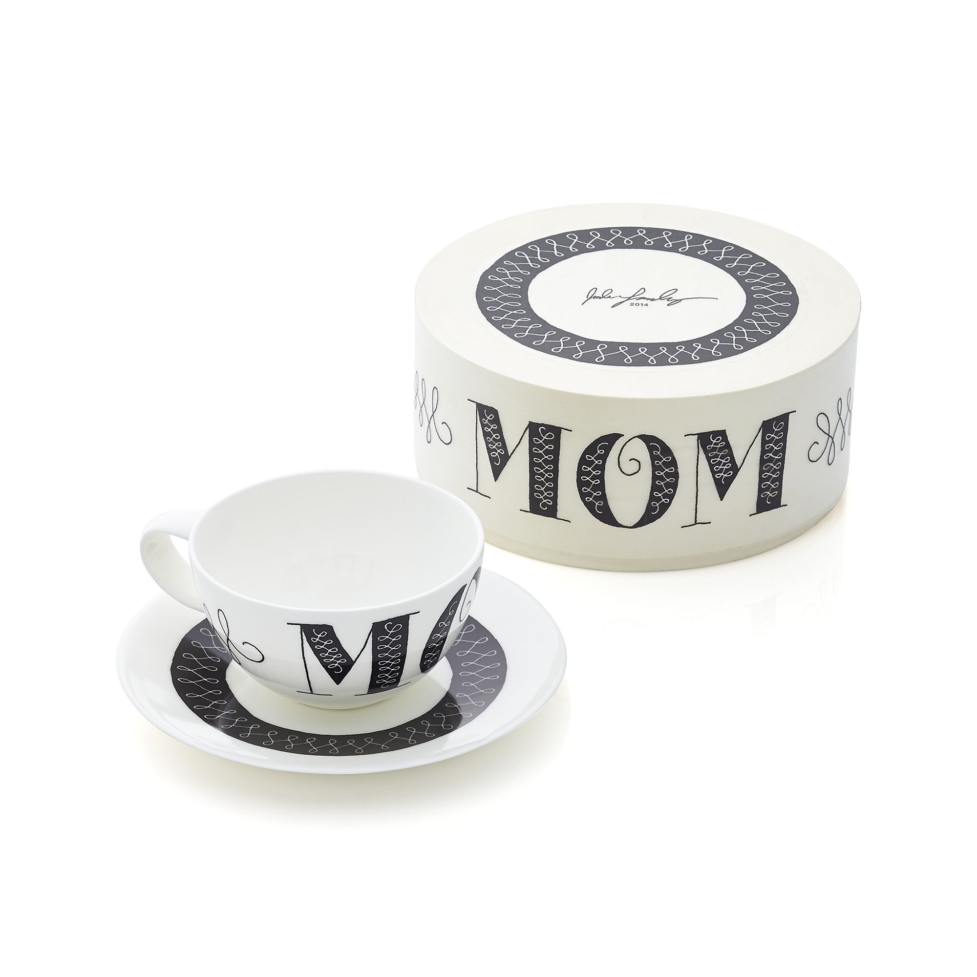
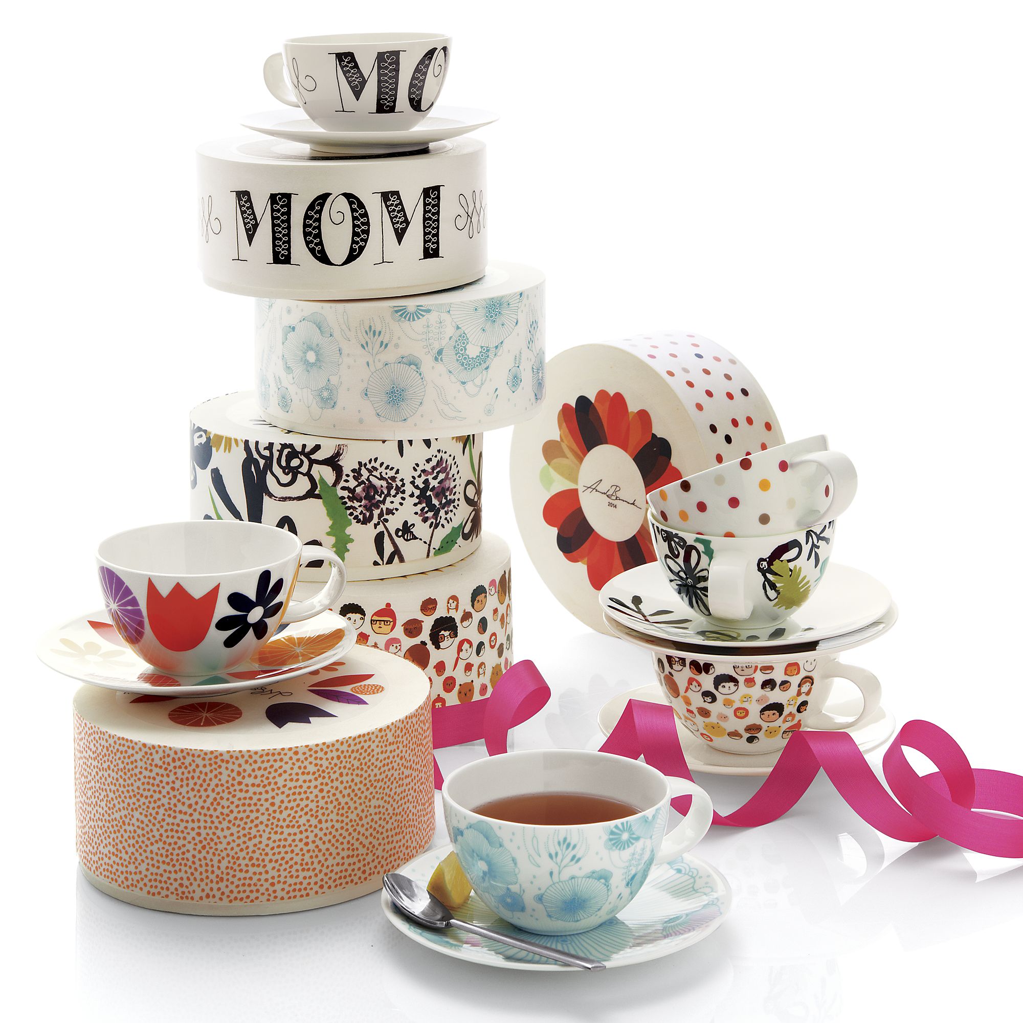
Bonnie decided she liked option #2 the best, so that ended up being the final artwork. I passed along the digital files and the good people at Crate&Barrel handled the production. I don't usually work on these types of projects, and waiting 8 months just to see the final product was unusual. I am very pleased with the final result. One surprise that I didn't know about was the packaging. The cup is packaged in a round wooden box, similar to a small hat box. Below you can see images of the final cup along with the entire series.
I'd like to offer a special thanks to the three most important mothers in my life. My beautiful wife Alisha, my own mother Cindy, and my mother-in-law Linda. Thank you for all that you have each done for me! If you would like to purchase one of the teacups, head over to Crate&Barrel.